Blog — Paul Rudolph Institute for Modern Architecture

Seth Weine

Rudolph at Burroughs Wellcome: Concept, Development, and the Caring Details

The Burroughs Wellcome was designed for growth—and this is a section drawing study by Paul Rudolph, for an extension to the building. Such a colorful drawing might look exuberantly and boldly “arty” (as though the architect had only a nebulous relat…

The Burroughs Wellcome was designed for growth—and this is a section drawing study by Paul Rudolph, for an extension to the building. Such a colorful drawing might look exuberantly and boldly “arty” (as though the architect had only a nebulous relation to practicalities)—but a close inspection shows that, while Rudolph was developing the overall concept, he was simultaneously paying close attention to dimensions, adjacencies, floor heights, and the locations of different functions. This kind of drawing—seemingly florid, but layered with distilled, practical information—is typical of the kind of study drawings which Paul Rudolph did at the beginning of his design process. © The Estate of Paul Rudolph, The Paul Rudolph Heritage Foundation.

"We Must Understand That After All The Building Committees, The Conflicting Interests, The Budget Considerations, And The Limitations Of His Fellow Man Have Been Taken Into Consideration, The Architect’s Responsibility Has Just Begun. He Must Understand That Exhilarating, Awesome Moment.

When He Takes Pencil In Hand, And Holds It Poised Above A White Sheet Of Paper, He Has Suspended There All That Has Gone Before And All That Will Ever Be." 

—Paul Rudolph

ARCHITECTURAL DESIGN: THE MYSTERY

In looking at Burroughs Wellcome—one of Paul Rudolph’s best (and best loved) creations—one naturally wonders: How did such a design come to be? With a prolific architect like Rudolph, whose creativity took him along so many different paths, that’s a compelling inquiry.

“How does the magic happen?” That’s one way of putting one of the most fascinating questions about the creation of architecture—for it’s indeed a wonder how one gets all-the-way from a client’s request to a tangible, solid, building that’s ready-for-occupancy.

The least mysterious phase happens at the end of the process: once a “construction set” of drawings (sometimes called “working drawings” or the “contract set”) has been drawn-up by he architect and issued to the general contractor, the process of construction is fairly well understood. [Although, as anyone who’s ever been involved in building project can tell you, it is also fraught with possible pitfalls, detours, and surprises.]

But perhaps it would be useful to return to the beginning of the process….

ARCHITECTURAL DESIGN: THE PROGRAM

Initially, the architect receives requests and information from the client: the “program”. Sometimes this is nebulously articulated—or conversely, sometimes the client’s needs are enumerated in intimidatingly calibrated detail. Rudolph wrote urgently about the need to get, early on, as much info as possible:

“Always, always, always, everything, everything, everything at the beginning. I'm a great believer in the big bang. You cannot isolate parts, ever. That's the reason why it's so important to know as much detail as possible at the very beginning.”

“I'm just saying that for me it's a matter of getting your fingers on what you can and cannot do from a legal viewpoint . . . . You have to know what's possible. Architecture is not a question of the purely theoretical if you're interested in building buildings. It's the art of what is possible.”

A sketch by Paul Rudolph, in which he’s working out the design of a hallway within Burroughs Wellcome. This sort of drawing shows another aspect of the architect’s working method: the section is sketched adjacent to the plan, and at the same scale (…

A sketch by Paul Rudolph, in which he’s working out the design of a hallway within Burroughs Wellcome. This sort of drawing shows another aspect of the architect’s working method: the section is sketched adjacent to the plan, and at the same scale (so that both can be well coordinated). At top right one can clearly see part of the plan layout, including rooms and what appear to be laboratory benches. © The Estate of Paul Rudolph, The Paul Rudolph Heritage Foundation.

At Burroughs Wellcome—which functioned as not only a corporate headquarters, but as also an active pharmaceutical research center with extensive laboratories and testing facilitates (where Nobel Prize winning work was conducted!)—Rudolph would have received a careful listing of the functions that the 300,000 square foot building had to accommodate, including the approximate sq. ft. area needed for each. Sometimes programs also indicate significant “adjacencies” (what specific spaces need to be nearby each other).

Just as important (as the above “material” needs) are the intangible ones: what the project means to the client, and what it will communicate. Significance and symbolism: they’re as much part of the program as the list of required rooms. It’s not always easy to determine this, and clients are generally not used to articulating such matters. As Rudolph states, it’s important to find out..

“…what it is the owner truly wants to do— but he doesn't necessarily tell you, you have to read between the lines— and what should be done ideally.”

ARCHITECTURAL DESIGN: THE GRAND SYNTHESIS

It is at this point that the mystery truly begins. The architect creates an overall concept for the building’s organization: the “parti”—and with it will be the architect’s most central decisions about the building’s placement on the site, the organization of the plan, and the shaping of spaces and volumes—along with concepts about which structural system and what materials are to be used.

Looking over the architect’s shoulder—in the process of creation? Here Paul Rudolph is photographed working at his drawing board in his New Haven office, with members of his staff in the background.

Looking over the architect’s shoulder—in the process of creation? Here Paul Rudolph is photographed working at his drawing board in his New Haven office, with members of his staff in the background.

How this happens—the very process of creation—is one of the great human questions, whether it be examined in the context of painting, music, literature, or architecture. Some architects refuse even to talk about it, claiming it’s a very intimate matter (and likely, one they don’t even quite understand themselves.) Some are prolix in their explanations, offering either theoretical, meat-and-potatoes, or poetic rationales for what they do. At the other end of the spectrum are “functionalist” architects like Hannes Meyer (who, for several years, was director of the Bauhaus): he claimed that arriving at design solutions was like solving an a mathematical problem, and he offered a stark equation: Function x Economy = Architecture. Rudolph repudiated such such an extreme position, saying:

All I'm really saying is that the most rational architect in the world is not to be trusted at all because there is no such thing as true rationalism when you are speaking of architecture.

Rudolph himself acknowledged the mystery of the phenomena of creation:

“In terms of how one goes about designing anything, you don't really know, or at least I don't know, until after the fact. There are so many elements that come into play that if you wait to figure out what it is you truly want to do once you have a project to work on there won't be enough time. You have to, as I see it, have a reservoir of things that you feel should be done and then you draw on that reservoir and hopefully apply elements from that reservoir in an intelligent fashion. . . . . You can have one hundred reasons why you do things after the fact.”

“I can say that in spite of all the rationalizations that architects go through, including myself, you can pay no attention to what architects say, you can only pay attention to what they do.”

Because architecture must deal with very practical issues—from space needs -to- the structural capacity of steel—the truth about the nature of architectural creation would necessarily be a merging of the functional and the artistic ways of solving problems. Beyond that, the essential nature of the “synthetic leap” is conjectural (though the topic of design creativity has been an area of ongoing serious research.)

ARCHITECTURAL DESIGN: DEVELOPMENT

Burroughs Wellcome allows us to see another aspect of architectural creation: “design development.”

Architects use “development” in a different sense than is used in the real estate field. Architecturally, it means taking the designer’s original conception of the building and working out the particulars.

A section sketch drawing, by Paul Rudolph, showing him in the process of designing the canopy for the main entrance to the Burroughs Wellcome building. A good example of design development, the drawing shows how Rudolph was working out his idea abou…

A section sketch drawing, by Paul Rudolph, showing him in the process of designing the canopy for the main entrance to the Burroughs Wellcome building. A good example of design development, the drawing shows how Rudolph was working out his idea about the shaping of the space and volumes—yet simultaneously thinking through the structure (steel beams and possibly steel joists are shown), scale (his placement of figures), choice of materials, and key dimensions. His use of color, to indicate different materials and planes, is part of the language of architectural drawing which extends back to the 18th century. © The Estate of Paul Rudolph, The Paul Rudolph Heritage Foundation.

For example: it’s not enough that the architect might have started out by envisioning a lobby with cantilevered balconies, supported by a steel structure. In the design development phase, the exact heights, projection, angles, and materials of those balconies would begin to be thought through (including their relationship to the building’s structure.)

Below is Rudolph’s perspective- section rendering through the Burroughs Wellcome building and site:

Paul Rudolph’s perspective-section rendering through Burroughs Wellcome, cutting though the main entry lobby, and showing the building’s relation to the site. © The Estate of Paul Rudolph, The Paul Rudolph Heritage Foundation.

Paul Rudolph’s perspective-section rendering through Burroughs Wellcome, cutting though the main entry lobby, and showing the building’s relation to the site. © The Estate of Paul Rudolph, The Paul Rudolph Heritage Foundation.

In the middle of it, he shows one of the building’s most famous features— it’s entry lobby:

Enlargement of a portion of Paul Rudolph’s perspective-section through the Burroughs Wellcome building, focusing in on the main entry lobby. © The Estate of Paul Rudolph, The Paul Rudolph Heritage Foundation.

Enlargement of a portion of Paul Rudolph’s perspective-section through the Burroughs Wellcome building, focusing in on the main entry lobby. © The Estate of Paul Rudolph, The Paul Rudolph Heritage Foundation.

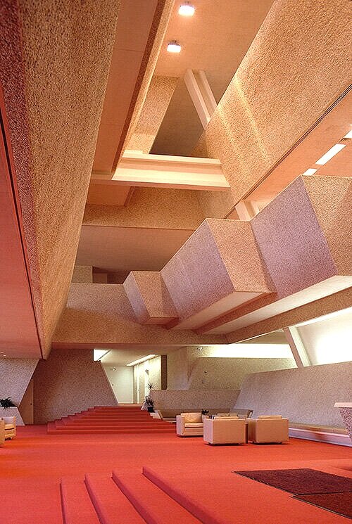
Clearly, he already—even at this stage—has a thorough conception the layout and features of this lobby. In this rendering one can see important features, including: the stepped volumes at the right side of of the second floor’s balcony, the steps and platforms in the foreground and in the distance, the beam crossing from one side of the third floor’s balcony to the other, and the angled columns.

And in the actual, built space—

Burroughs Wellcome’s main entry lobby. Image courtesy of the Massachusetts Institute of Technology, photograph by G. E. Kidder Smith

Burroughs Wellcome’s main entry lobby. Image courtesy of the Massachusetts Institute of Technology, photograph by G. E. Kidder Smith

—these aspects of the design were almost exactly carried out.

Enlarging a portion of that section-perspective rendering reveals that Rudolph was already thinking about the structural aspects of the building—and not just the diagonal columns. Below you can see that the section cuts through steel beams—and, allowing for perspective, that steel-work would have framed directly into the diagonal vertical structure.

Close-up of Paul Rudolph’s perspective-section through the Burroughs Wellcome building, here focusing in on the main lobby’s third floor balconies. © The Estate of Paul Rudolph, The Paul Rudolph Heritage Foundation

Close-up of Paul Rudolph’s perspective-section through the Burroughs Wellcome building, here focusing in on the main lobby’s third floor balconies. © The Estate of Paul Rudolph, The Paul Rudolph Heritage Foundation

One might imagine that, for an architect of Rudolph’s vast experience, inclusion of such structural elements in a rendering (and placing them in the right locations) would be almost intuitive. Perhaps—so for a clearer example of development, let’s look at what happens when the Burroughs Wellcome building section needs to move in the direction of constructable drawings.

Close-up of Paul Rudolph’s perspective-section rendering of Burroughs Wellcome, focusing on the main body of the building and its entry lobby. © The Estate of Paul Rudolph, The Paul Rudolph Heritage Foundation

Close-up of Paul Rudolph’s perspective-section rendering of Burroughs Wellcome, focusing on the main body of the building and its entry lobby. © The Estate of Paul Rudolph, The Paul Rudolph Heritage Foundation

Above is an enlargement of the main body of the building’s section-perspective. It’s beautiful to look at, and Rudolph’s legendary skill as a perspectivist pulls us in, fascinated by the forms he’s chosen and the rich ways he’s depicted them.

But this is where design development begins: those forms and spaces need to be exactly defined and dimensioned, materials need to be specified, and the relationship of all the parts needs to be coordinated with precision (including with the structural system). Below is the a drawing, from Rudolph’s office, which does this: it’s filled with notes, dimensions, and shows the relationship of the section to adjacent parts of the building which are beyond. This development will then lead to more drawings—which contain even more construction information (including final details)

Section drawing, through main entrance, of the Burroughs Wellcome building. © The Estate of Paul Rudolph, The Paul Rudolph Heritage Foundation.

Section drawing, through main entrance, of the Burroughs Wellcome building. © The Estate of Paul Rudolph, The Paul Rudolph Heritage Foundation.

ARCHITECTURAL DESIGN: CARE IN THE DETAILS

When someone refers to “details,” they are usually peaking of the smallest (or least important) aspects of a project or situation—and the use of the term is often dismissive. But in architecture, the opposite is true: the “details” are intensely important. When architects say “details,” they mean the particular ways that the parts (and assemblies of parts) and materials of a building are selected, shaped, located, and connected together.

Rudolph’s attention to the detail was comprehensive, and even extended to the drainage channels (which he used to form striking angled lines on the building’s exterior), aligning them with the window divisions (“muntins”) and designing a ground-leve…

Rudolph’s attention to the detail was comprehensive, and even extended to the drainage channels (which he used to form striking angled lines on the building’s exterior), aligning them with the window divisions (“muntins”) and designing a ground-level concrete element (“splash block”) that further carried out the linear theme. Photograph © PJ McDonnell, The Paul Rudolph Heritage Foundation Archives

This can extend to from things that occupants would hardly ever notice (like how waterproofing materials are positioned), to things they directly see and engage with daily (like the design of railings, elevator buttons, and even the choice of typeface for the building address numbers.) These visual elements may, in themselves, be small—-but cumulatively they convey a sense that the building was designed with thoroughness and unflagging attention. It shows that the architect cared, and that each decision (whether it be about the shape of a stair nosing or the tint of the windows) is consistent with an overall vision for the building. [And if such care is not exercised, even a new building can convey a sense of disheartening sloppiness.]

Rudolph cared.

He learned this not only from his teachers, like Gropius (the drawings for whose projects are detailed with surprising care), but also from the beginning of his practice, when he had to become inventive with inexpensive materials in order to work within modest construction budgets. And of course, Mies van der Rohe—one of the titans of Modernism—had a famous saying that all architects knew well: “God is in the details.”

A building’s construction set, which includes drawings of all the details, occupies a large part of an architect’s (and their staff’s) attention. This can mean generating dozens (and for some very complex buildings: hundreds) of drawings. It’s a challenge to maintain the architect’s original “vision” of the building, so that it does not get distorted or diluted in the course of creating the construction documents from which it will be built.

A CASE STUDY: DETAILS AT BURROUGHS WELLCOME

At Burroughs Welcome, we can follow an example of the care which Rudolph and his team brought to the details.

Below-left is reproduced the right side of Rudolph’s perspective-section through Burroughs Wellcome. In it we can see that the edges of the floors typically terminate in a set of continuous architectural elements: a band of angled windows, a band of angled skylights, and a band of angled portions of the exterior wall.

Below-right is an enlargement of the uppermost example of that floor-window-wall-skylight assembly. The architect, in doing the construction drawings, will be concerned about each juncture:

  • Where the top of the skylight meets the building (in this case: there’s a small upright, at the end of the floor, at the top of the skylight—possibly forming a rainwater drainage channel.)

  • The bottom of the skylight, where it meets the top of the angled wall.

  • The bottom of the angled wall, where it meets the top of the angled window.

  • The bottom of the window, where it meets the angled skylight of the next floor down.

window+side+section.jpg
Left: a portion of Rudolph’s section-perspective, showing the the right side of the building. Above: an enlargement of one of the assemblies at the edge of the uppermost floor. It includes the angled skylight, angled exterior wall, and angled window…

Left: a portion of Rudolph’s section-perspective, showing the the right side of the building. Above: an enlargement of one of the assemblies at the edge of the uppermost floor. It includes the angled skylight, angled exterior wall, and angled window. Both drawings © The Estate of Paul Rudolph, The Paul Rudolph Heritage Foundation.

Exactly how each one of these adjacencies (architects’ term for them is: “conditions”) is to be detailed is one of the great challenges of an architect’s practice—especially if they care that the details are consistent with (and supportive of) their original vision for the building.

In working out the details, an architect will not only be conscious of their general concept for the building, but they will simultaneously be focused on a large number of practical questions, such as:

  • Can these conditions be made waterproof?

  • Is there sufficient thermal insulation?

  • Are the proposed materials available?

  • Will building this assembly fit within the construction budget?

  • Can the proposed arrangement be built by available construction methods?

  • Does the proposed design allow for regular maintenance to be performed?

  • If something needs replacement(like a window pane), can it be easily repaired?

  • Will the materials age well?

And—-

  • If any of the above presents a problem, what alternatives can be devised (which will not violate the architect’s overall conception for the building)?

Below is one sheet from the extensive set of construction drawings that Rudolph and his office prepared for the Burroughs Wellcome building—and it shows the very assembly we’ve been considering!

Detail of inclined window and skylight section and construction details, from the set of construction drawings prepared by Paul Rudolph and his office for the Burroughs Wellcome building. © The Estate of Paul Rudolph, The Paul Rudolph Heritage Found…

Detail of inclined window and skylight section and construction details, from the set of construction drawings prepared by Paul Rudolph and his office for the Burroughs Wellcome building. © The Estate of Paul Rudolph, The Paul Rudolph Heritage Foundation

Below is an enlargement of the right side of that drawing. It goes into great detail about all of the adjacencies (from top-to-bottom: roof to skylight; skylight to wall; wall to window, and window to skylight.) Materials, dimensions, connections, required features, and relationships to other parts of the building are noted with thoroughness.

But even that is not sufficient. To get the building built—in the way the architect envisioned it—even more information needs to be provided to the contractor.

An enlargement of a portion of the above drawing, focusing on the inclined window and skylight. The circled area indicates the areas of the assembly where the glazing meets the building’s walls—and those adjacencies are worked-out in great detail be…

An enlargement of a portion of the above drawing, focusing on the inclined window and skylight. The circled area indicates the areas of the assembly where the glazing meets the building’s walls—and those adjacencies are worked-out in great detail below, in a sheet from the same set set of construction drawings.© The Estate of Paul Rudolph, The Paul Rudolph Heritage Foundation

The great English architect, Sir Edwin Lutyens, said construction drawings were like “a writing letter to the builder” telling him what to do. For Burroughs Wellcome, even more detail had to be put into Rudolph’s “letter” to the contractor—and within the the area we’ve circled (above) are three conditions that needed to be magnified further, in order to really show how they’re to be built.

Below is the drawing which resulted—another sheet in the construction set. These details are drawn-full size, and show precisely the shapes, configurations, materials, and dimensions of every component—metalwork, structure, glass, waterproofing, drainage channel, glazing gaskets, connectors, and even an anchor for the window washer—needed to make the assembly buildable, and practical for ongoing life of he building.

Inclined window and skylight construction details, from the set of constuction drawings prepared by Paul Rudolph and his office for the Burroughs Wellcome building. © The Estate of Paul Rudolph, The Paul Rudolph Heritage Foundation.

Inclined window and skylight construction details, from the set of constuction drawings prepared by Paul Rudolph and his office for the Burroughs Wellcome building. © The Estate of Paul Rudolph, The Paul Rudolph Heritage Foundation.

Rudolph himself recognized the challenge of doing thorough construction drawings (including the detailing)—and the consequences if the challenge is not met and the vision is lost:

“Architecture is a personal effort, and the fewer people coming between you and your work the better. … This is a very real problem, and you can only stretch one man so far. The heart can fall right out of a building during the production of working drawings, and sometimes you would not even recognize your own building unless you followed it through.”

All that work, all that thinking, all that time—just to get the details right.

Easy? No. Important? Supremely! Did Rudolph do it? Absolutely!

SAVE BURROUGHS WELLCOME !

Losing Burroughs Wellcome would be a cultural disaster—a titanic loss to our country’s cultural heritage.

When a great building is destroyed, there are no second chances.

FOR NOW, THERE ARE TWO THINGS YOU CAN DO:

  • Sign the petition to save Burroughs Wellcome. You can sign it here.

  • We’ll send you bulletins about the latest developments. To get them, please join our foundation’s mailing list: you’ll get all the updates, (as well as other Rudolphian news.)—you can sign up at the bottom of this page.

Models were also part of Rudolph’s design process. This would be a “presentation model”—shown to the client for their final approval, as well as for the corporate leadership to use to communicate about the project to stakeholders and the public. But…

Models were also part of Rudolph’s design process. This would be a “presentation model”—shown to the client for their final approval, as well as for the corporate leadership to use to communicate about the project to stakeholders and the public. But “alumni”—former staff members of his office—have also told us that Rudolph also used models to develop his designs. © The Estate of Paul Rudolph, The Paul Rudolph Heritage Foundation.

Burroughs Wellcome was a pharmaceutical company, whose corporate symbol was a unicorn. In Rudolph’s model of the building (at left), he proposed a large unicorn sculpture as part of the main entrance plaza. It did not work out to include that sculpt…

Burroughs Wellcome was a pharmaceutical company, whose corporate symbol was a unicorn. In Rudolph’s model of the building (at left), he proposed a large unicorn sculpture as part of the main entrance plaza. It did not work out to include that sculpture—so Rudolph developed and distilled the idea. What he came up with (and got built) is a prominent flagpole, angled and pointed to evoke a unicorn’s horn—a brilliant feature and detail.

Burroughs Wellcome is a STAR ! — in film and television.

Paul Rudolph’s Burroughs Wellcome building, in North Carolina’s Research Triangle Park, was the prime location for the 1983 film, Brainstorm. Scenes were shot inside, outside, and on the grounds of the building. This candid snapshot, made between “t…

Paul Rudolph’s Burroughs Wellcome building, in North Carolina’s Research Triangle Park, was the prime location for the 1983 film, Brainstorm. Scenes were shot inside, outside, and on the grounds of the building. This candid snapshot, made between “takes”, shows a warning sign temporarily placed within the set of the villain’s office.

FROM STARCHITECTS -TO- STARRING BUILDINGS

Some architects’ work has “that something extra”—that star quality which gets their buildings to be selected as sets for films and television series. Set designers, like the legendary Ken Adam (famous for his work on Dr. Strangelove and the James Bond films) can create miracles—but directors and designers also welcome using actual, existing buildings & interiors as sets, and actively seek out interesting venues.

Buildings by Frank Lloyd Wright and John Lautner, are “a natural” for this, as their richly sculpted & textured works provide backgrounds that are already saturated with visual interest. Wright’s Ennis House (1924) may solidly sit in the Los Feliz neighborhood of Los Angeles—but that hasn’t stopped directors from using it (or creating sets inspired by it) for many productions—including: Blade Runner, Game of Thrones, Star Trek, Day of the Locust, Twin Peaks, and even South Park.

If you search for “Ennis House” and film in Google Images, one will get numerous hits. This example—an screen shot of part of a results page—shows that stills from Game of Thrones (upper left) and Blade Runner (lower left) readily come up. Both of t…

If you search for “Ennis House” and film in Google Images, one will get numerous hits. This example—an screen shot of part of a results page—shows that stills from Game of Thrones (upper left) and Blade Runner (lower left) readily come up. Both of them are said to have been inspired by the Ennis house. The other views show the Wright designed interior and exterior of the actual house.

Ken Adam chose John Lautner’s Elrod House as a set for the James Bond film, Diamonds Are Forever—and several other Lautner houses have been used in major films, including in The Big Lebowski and Iron Man.

RUDOLPH ON tHE BIG SCREEN

Paul Rudolph’s work fits well with this, offering intriguing designs which would attract a director’s and production designer’s eye. His work has been used in a variety of films, from the frenetic fire drill scene in 2001’s The Royal Tenenbaums -to- 2019’s Motherless Brooklyn (a film in which one of Rudolph’s visionary renderings forms part of the set).

In Motherless Brooklyn, one of Paul Rudolph’s renderings for the LOMEX project can be seen in the background, during a scene set in Moses Randolph’s office. Below is a full view of Rudolph’s actual rendering for this urban design. Drawing © The Esta…

In Motherless Brooklyn, one of Paul Rudolph’s renderings for the LOMEX project can be seen in the background, during a scene set in Moses Randolph’s office. Below is a full view of Rudolph’s actual rendering for this urban design. Drawing © The Estate of Paul Rudolph, The Paul Rudolph Heritage Foundation.

full+actual+LOMEX+rendering.jpg
A Google Images search for the terms “Royal Tenenbaums” and “fire drill” gives results like shown in the above screen shot: an interior of Rudolph’s own penthouse residence in Manhattan (top left); and Rudolph’s penthouse’s used as a set in the film…

A Google Images search for the terms “Royal Tenenbaums” and “fire drill” gives results like shown in the above screen shot: an interior of Rudolph’s own penthouse residence in Manhattan (top left); and Rudolph’s penthouse’s used as a set in the film, with Ben Stiller conducting a home fire drill (lower left).

BURROUGHS WELLCOME GOES TO THE MOVIES

The Burroughs Wellcome building comes up in at least two major film productions:

At top: a rendering of a set for The Towering Inferno.At bottom: a still from the film, for the same scene. Paul Newman (his back is foreground left), in the role of the architect, is shown entering his office.Are we seeing a set design that was ins…

At top: a rendering of a set for The Towering Inferno.

At bottom: a still from the film, for the same scene. Paul Newman (his back is foreground left), in the role of the architect, is shown entering his office.

Are we seeing a set design that was inspired by Paul Rudolph’s work at Burroughs Wellcome?

THE TOWERING INFERNO

Although Burroughs Wellcome’s most famous “starring role” is in 1983’s Brainstorm (see below), it at least seems to have inspired a set in a film made nearly a decade earlier: 1974’s The Towering Inferno.

A lushly cast production, it included the talents of mega-stars Paul Newman, Steve McQueen, Faye Dunaway, William Holden, and Fred Astaire—as well as numerous other performers.. One of the main characters (played by Newman) is an architect—the designer of the tower which (no fault of his!) goes up in flames. His entrance scenes are the embodiment of a late-60s/early 70’s architect’s fantasy.

At top right is a set designer’s rendering of the architect’s office, and below is a view of the finished set. The forceful use of angled planes (at walls, windows, built-in furniture, and ceilings), emphatic volumes, stairs, and the bold use of color resonate with Paul Rudolph’s work at Burroughs Wellcome. Might Rudolph’s design have inspired the filmmakers?

BRAINSTORM

Brainstorm (1983) is a science fiction film with a stellar cast: Christopher Walken, Natalie Wood, Louise Fletcher, and Cliff Robertson. It had a distinguished director, Douglas Trumbull (who had made contributions to the visual and photographic effects of 2001: A Space Odyssey, Star Trek: The Motion Picture, Blade Runner, and Close Encounters of the Third Kind.)

The film focuses on a research team's efforts to perfect a device that can record the sensory experiences and emotional feelings of a subject (and can then replay them, so that another person can access that experience too). Part of the drama is that it includes a scheme, by the company's management, to apply the results of their research to military uses that may be criminal or of questionable ethics.

A director of Trumbull’s sensibilities—having worked on numerous futuristic-science oriented films—would naturally be drawn to the building and interior environments of Burroughs Wellcome.

The typical doorway arch of the Krell, an advanced alien civilization, as designed for the 1956 film, Forbidden Planet. Such angular geometries are a frequent motif in the work of science fiction film set designers.

The typical doorway arch of the Krell, an advanced alien civilization, as designed for the 1956 film, Forbidden Planet. Such angular geometries are a frequent motif in the work of science fiction film set designers.

One of the most striking aspects of the building—both of its exterior and interiors—is its comprehensive use of angles: walls, windows, structural elements, and even the flagpole are angled to follow the overall theme that Rudolph applied across the complex. This creates exciting settings, with striking views and unexpected forms.

Reliance on such geometries has a distinguished lineage in film design, as in this scene (shown at right) from the classic science fiction film, Forbidden Planet (1956). Here, a doorway built by an alien civilization is emphatically angular (and similar forms show up in Brainscan.)

Below are some some screen shots of the building, inside and out, as used in Brainscan:

Nighttime, the building is a formidable presence…

Nighttime, the building is a formidable presence…

… as it is during the day.

… as it is during the day.

The building’s famous entry lobby didn’t have to be extensively modified for the movie—it was already impressive.

The building’s famous entry lobby didn’t have to be extensively modified for the movie—it was already impressive.

Strong diagonals pervade the sets, both inside …

Strong diagonals pervade the sets, both inside …

… and on the outside.

… and on the outside.

Even in the laboratory—where key scenes occur—the angled structural geometry is prominent..

Even in the laboratory—where key scenes occur—the angled structural geometry is prominent..

Diagonal design extends to the executive suite …

Diagonal design extends to the executive suite …

… and even into the bathrooms.

… and even into the bathrooms.

And shows up as an angular fantasy within the film. Was this too inspired by Rudolph’s design for Burroughs Wellcome (as exemplified in one of the building’s hallways. at right)? Photo by Henry L. Kamphoefner

And shows up as an angular fantasy within the film. Was this too inspired by Rudolph’s design for Burroughs Wellcome (as exemplified in one of the building’s hallways. at right)? Photo by Henry L. Kamphoefner

BW+hallway.jpg

BURROUGHS WELLCOME ON TV

REVOLUTION

Revolution (2012-2014) was a science fiction TV series that, across 2 seasons and 42 episodes, took the viewer into a future where a massive blackout—at that point, lasting 15 years—has terminated the use of electrical power all across the planet. The series traces a search for for the blackout’s mysterious cause (and its possible cure), set against a complex scenario of conflicting personal relationships and political machinations.

The last two episodes of season 1 are set in and around a powerful tower—a place which may be key to understanding the blackout (and solving it). Much of the first season of the series was shot in the Carolinas, and Burroughs Wellcome—with its characteristic diagonals—was used used as the set for some of the tower’s interiors.

Below are several scenes, shot in Burroughs Wellcome, from the show:

Burroughs Wellcome’s entry lobby—one of the building’s most powerful features—is tapped by the director and designer for a dynamic interior set.

Burroughs Wellcome’s entry lobby—one of the building’s most powerful features—is tapped by the director and designer for a dynamic interior set.

The bunker office of the US Vice President may well be the very same location as used for the evil executive’s office in the film Brainscan.

The bunker office of the US Vice President may well be the very same location as used for the evil executive’s office in the film Brainscan.

S01E19A.jpg
These views (from the show) are of special note because they allow one to see the aggregate finish which Paul Rudolph developed for the building—and …

These views (from the show) are of special note because they allow one to see the aggregate finish which Paul Rudolph developed for the building—and …

… which he used not only for Burroughs Wellcome’s exteriors, but also for some of the building’s interiors (including lobbies and offices).

… which he used not only for Burroughs Wellcome’s exteriors, but also for some of the building’s interiors (including lobbies and offices).

SAVE THIS GREAT ARCHITECTURAL “STAR”

Losing Burroughs Wellcome would be a disaster—a titanic loss to our country’s cultural heritage.

When a great building is destroyed, there are no second chances.

FOR NOW, THERE ARE TWO THINGS YOU CAN DO:

  • Sign the petition to save Burroughs Wellcome. You can sign it here.

  • We’ll send you bulletins about the latest developments. To get them, please join our foundation’s mailing list: you’ll get all the updates, (as well as other Rudolphian news.)—and you can sign up at the bottom of this page.

Modular+BW.jpg

Rudolph was visionary—and it certainly makes sense that some of his built “visions”—like Burroughs Wellcome—would attract the eyes of directors, production designers, and location scouts. It can evoke a variety of impressions—from bright to somber—depending on lighting, point-of-view, time-of-day, weather, and season. While most people coming to Burroughs Wellcome recall it as a pleasant place to work or visit, Joseph Molitor was able to create an image of “Moody Futurism” in this photograph—an atmosphere sure to be of interest to the makers of films and television.

It would be great if Burroughs Wellcome was used for more film and television productions—and for that: it has to be saved.

Image courtesy of Joseph W. Molitor architectural photographs. Located in Columbia University, Avery Architectural & Fine Arts Library, Department of Drawings & Archives

Paul Rudolph's spectacular Burroughs Wellcome Headquarters — a History

Paul Rudolph’s Burroughs Wellcome headquarters & research center in Durham, N.C. Image courtesy of the Massachusetts Institute of Technology, photograph by G. E. Kidder Smith

Paul Rudolph’s Burroughs Wellcome headquarters & research center in Durham, N.C. Image courtesy of the Massachusetts Institute of Technology, photograph by G. E. Kidder Smith

Out of a half-century career of creative and prolific work, Rudolph’s Burroughs Wellcome headquarters & research center stands out as one of his finest works. We’re now fighting to save this magnificent example of the convergence of corporate & scientific vision and architectural talent—and we thought it would be useful to share an outline of it’s history, purpose, and features.

A SITE FOR GROWTH: THE RESEARCH TRIANGLE PARK

The Burroughs Wellcome building (shown circled here), at 3030 East Cornwallis Road, in Durham, N.C.’s Research Triangle Park. Only a portion of this celebrated research development is shown here, but even in this partial view, one can see some of Bu…

The Burroughs Wellcome building (shown circled here), at 3030 East Cornwallis Road, in Durham, N.C.’s Research Triangle Park. Only a portion of this celebrated research development is shown here, but even in this partial view, one can see some of Burroughs Wellcome’s distinguished neighbors—among them: IBM, Cree, Toshiba, RTI, the North Carolina Biotechnology Center, and the National Humanities Center. Image courtesy of Google Maps.

A closer aerial view of the Burroughs Wellcome complex. Shown here is its current state, after a Rudolph-designed addition to the building (that had been located to the lower-left) had been demolished by the current owner. Landscape features, design…

A closer aerial view of the Burroughs Wellcome complex. Shown here is its current state, after a Rudolph-designed addition to the building (that had been located to the lower-left) had been demolished by the current owner. Landscape features, designed by Rudolph, have also been removed from the site. Image courtesy of Google Maps.

41vyBafn%252BpL._SR600%252C315_PIWhiteStrip%252CBottomLeft%252C0%252C35_SCLZZZZZZZ_.jpg

Founded in 1959, Durham, North Carolina’s Research Triangle Park is one of the most prominent research developments in the US. This is where hundreds of distinguished firms and organizations located their headquarters and research centers—and it is here that Burroughs Wellcome placed their US headquarters and laboratories.

They chose Paul Rudolph as their architect, and the project commenced design work in his office in 1969, and was completed and dedicated in 1972.

Burroughs Wellcome was designed for growth: the initial, main body of the building, was followed by several additions—in 1976, 1978, and 1982—all designed by Rudolph. His work in 1982 also included a master plan for the overall site.

The story of Durham’s Research Triangle Park is comprehensively told in Brain Magnet: Research Triangle Park and the Idea of the Idea Economy by Alex Cummings, PhD—and this fascinating study includes coverage of the Burroughs Wellcome building.

THE BUILDING: ITS PURPOSE, HISTORY, AND FEATURES

  • In February 1969, pharmaceutical company Burroughs Wellcome purchases a little over 66 acres of rolling woodland in Durahm, North Carolina’s Research Triangle Park. The company is a subsidiary of The Wellcome Foundation Ltd., based in the UK.

  • The client requests of Paul Rudolph a design that will be shaped to its needs, yet remain architecturally distinctive.

Burroughs Wellcome’s symbol is a unicorn—and Rudolph wanted to have a statue of a unicorn at the building’’s entry (it’s even shown on his architectural model for the building). When it did not work out to do include the statue, Rudolph came up with…

Burroughs Wellcome’s symbol is a unicorn—and Rudolph wanted to have a statue of a unicorn at the building’’s entry (it’s even shown on his architectural model for the building). When it did not work out to do include the statue, Rudolph came up with a creative alternative: a flagpole that would evoke the Burroughs Wellcome symbol, by being angled to match the unicorn’s horn.

  • Flexibility is a primary goal: each major area in Rudolph’s plan—laboratories, administration, and support services—are capable of being expanded by linear addition. To allow for this, Rudolph leaves the expansible ends of the building expressed as a pattern of flattened hexagons, so that the elements can be extended horizontally without disturbing the building’s visual order.

  • The building program includes 312,303 square feet of research laboratory and administrative space, including: 140 labs, a library, auditorium, cafeteria, and support activity spaces for 400 workers.

  • In plan, the building forms a giant “S”, with opposing arms that form a main entry court and a large service yard. Reception, cafeteria, library, auditorium, and administrative offices flank the entry court. Laboratories, research offices, and testing facilities surround the service yard.

  • The building exterior (and parts of the interior) is finished with a limestone aggregate which is sprayed-in-place, into to a plastic binder. [Rudolph used the same textured finish in several subsequent projects.] This exposed aggregate finish was used on 140,000 square feet of exterior walls and 90,000 square feet of interior walls. Rudolph estimated the finish required 20,000,000 stones to complete!

  • The building’s structure is an eccentrically loaded trapezoidal steel frame, with columns inclined at 22.5 degrees. Rudolph’s original slant of the design was changed at the request of the building’s structural system. This is the sort of practical accommodation that an architect who’d been long in practice, like Rudolph, would be used to receiving and accommodating.

  • The building is dedicated on Friday, April 7th 1972.

  • A collectors medallion is issued to celebrate the dedication which features a rendering of the building on one side, and a unicorn (the company’s logo) on the other side.

The ground-breaking ceremony marking the commencement of construction of the Burroughs Wellcome building in Durham’s Research Triangle Park. Paul Rudolph is at the right.

The ground-breaking ceremony marking the commencement of construction of the Burroughs Wellcome building in Durham’s Research Triangle Park. Paul Rudolph is at the right.

At completion, a commemorative medal was issued for the 1972 dedication.

At completion, a commemorative medal was issued for the 1972 dedication.

  • As part of the dedication ceremony, Rudolph gives a walking tour of the building. He writes a description of the building saying, “the building is conceived as a man-made extension of the ridge upon which it is built. The building is terraced, each floor being smaller that the one below it. Its placement allows people to enter from below walking through a courtyard and porch into the lobby.”

  • The building interior and exterior are used as part of the set for the 1983 science fiction film Brainstorm starring Christopher Walken and Natalie Wood. 

  • The building is originally known as the Burroughs-Wellcome Company Headquarters (and later the GlaxoSmithKline Building.)

  • The original building has several additions, all designed by Paul Rudolph, including: a Main Building addition in 1976, a Toxicology/Experimental Pathology Building addition in 1978 and a South Building Expansion in 1982. Rudolph also was asked to create a new Masterplan for the site in 1982.

  • The building is closed to the public for decades for security reasons, while pharmaceutical companies Glaxo, Glaxo Wellcome, and GlaxoSmithKline (GSK) actively use it as offices and research laboratories. Employees are not permitted to take cameras into the facility, due to the sensitivity of the research being conducted.

  • The building is renamed the Elion-Hitchings Building in 1988, honoring Gertrude Elion and George Hitchings - research chemists with Burroughs Wellcome who shared the 1988 Nobel Prize in Physiology or Medicine with Sir James Black. Their prize-winning research was done while they were working at the building.

  • On April 21, 1989 four ACT UP activists barricade themselves inside an office in the building: they demand a cut in the price of AZT (at that time the most expensive medicine in history.)

  • In 1995, Burroughs Wellcome and Glaxo merge to become Glaxo Wellcome, and a merger between that company and SmithKline Beecham establishes the company as GlaxoSmithKline. The company’s operations are then relocated another facility.

  • In February 2010 the building is listed for sale.

  • On June 30 2012, Glaxo sells its iconic Elion-Hitchings Building, two interconnected office building, ,and 140 acres of land for $17.5 million to United Therapeutics.

  • On October 20 2012, the building is opened for a public tour, arranged by Triangle Modernist Houses (now USModernist) with United Therapeutics. A video of the event can be watched here.

  • United Therapeutics demolishes part of the structure in 2014.

  • On September 4, 2020 United Therapeutics is issued a demolition permit for the building from the City of Durham. Clear Site Industrial, LLC is listed as the demolition contractor.

SAVE THIS GREAT ARCHITECTURE

Losing Burroughs Wellcome would be a cultural disaster—a titanic loss to our country’s cultural heritage.

When a great building is destroyed, there are no second chances.

FOR NOW, THERE ARE TWO THINGS YOU CAN DO:

  • Sign the petition to save Burroughs Wellcome. You can sign it here.

  • We’ll send you bulletins about the latest developments. To get them, please join our foundation’s mailing list: you’ll get all the updates, (as well as other Rudolphian news.)—you can sign up at the bottom of this page.

While Modern architecture has often been accused of being color-phobic (and primarily relying on a limited of primarily whites, grays, and beige), that was never true of Rudolph’s work. He could skillfully incorporate even the boldest colors—as show…

While Modern architecture has often been accused of being color-phobic (and primarily relying on a limited of primarily whites, grays, and beige), that was never true of Rudolph’s work. He could skillfully incorporate even the boldest colors—as shown here in a Burroughs Wellcome interior—which he used to enliven a building’s spaces. Photograph by Henry L. Kamphoefner

NOW UNDER THREAT: One of Paul Rudolph's most amazing designs— the Burroughs Wellcome HQ

Completed in 1972, the Burroughs Wellcome headquarters & research center shows Paul Rudolph at the height of his creative and problem-solving powers. Above, the main building is shown on the right, and the later extension (also by Rudolph) is on…

Completed in 1972, the Burroughs Wellcome headquarters & research center shows Paul Rudolph at the height of his creative and problem-solving powers. Above, the main building is shown on the right, and the later extension (also by Rudolph) is on the left. Photo by Joseph W. Molitor. Image courtesy of Joseph W. Molitor architectural photographs collection, located in Columbia University, Avery Architectural & Fine Arts Library, Department of Drawings & Archives.

RESEARCH, ARCHITECTURE—AND THE THREAT TO A GREAT BUILDING

Durham, North Carolina’s Research Triangle Park is one of the most prominent research developments in the US. It’s here that distinguished firms and organizations have chosen to place their headquarters and research centers—and it has facilities for hundreds of organizatons, including: IBM, Cree, BASF, Cisco, Lenovo, Underwriters Laboratories, and the EPA.

Some have attempted to construct not only efficient buildings, but ones of architectural merit.—and of all of them, it is Paul Rudolph’s BURROUGHS WELLCOME HEADQUARTERS which stands out.

But now, that building is threatened with destruction. A controversial demolition permit has been issued, and the future of the this architectural masterpiece is in immediate jeopardy. We’ll be giving you updates about this—including how you can help save it. But to start, we thought it would be well worth it to tell you a bit about the building—especially why it’s significant.

The client said they wanted an architecturally distinctive building. They got what they asked for—and Rudolph’s ability to create memorable and forward-looking architecture extended to all the spaces of the Burroughs Wellcome building. This can be s…

The client said they wanted an architecturally distinctive building. They got what they asked for—and Rudolph’s ability to create memorable and forward-looking architecture extended to all the spaces of the Burroughs Wellcome building. This can be seen most vividly in the main entry lobby (which also shows Rudolph’s bold handling of color.). Image courtesy of the Massachusetts Institute of Technology, photograph by G. E. Kidder Smith

A BUILDING dYNAMIC IN ITS TIME—AND FOR THE FUTURE

In a half-century career filled with architectural landmarks, gems, and masterworks, Burroughs Wellcome is on many people’s “top ten” list of Rudolph’s designs—and here are some reasons why it’s significant:

  • It is one of Rudolph’s largest constructed projects: So one sees, substantively, how a brilliant designer worked out his ideas about siting, planning, spatial organization, interiors, and finishes in a comprehensive, large-scale way, and over a variety of conditions and spaces.

  • A design for growth: Rudolph was concerned for the future—of cities, homes, education, and of individual buildings. He knew that, in very tangible ways, buildings are never finished, and must be flexible to accommodate the future. Rudolph designed Burroughs Wellcome with change and expansion in mind: its striking geometries and planning were designed for growth. In fact, this was not just one building, but a growing complex: the main building being designed in 1969; and with extensions added in 1976, 1978, and 1982—that latter date including work on a master plan for the site. [In architecture, as in other fields, there’s no greater compliment than “repeat business.”—and that Rudolph was repeatedly called back by the Burroughs Wellcome leadership shows that his work was practical and beneficial.]

  • New paths in creating space: Even though he profoundly respected Mies and Gropius (and acknowledged their importance to him) Rudolph rejected their “universal space” concept—an approach to architectural planning which led to undifferentiated, bland, grid-like spaces: the kind found so often found in the office and educational building designs of his contemporaries. Like Wright, Rudolph sought to create spaces of variety and richness, ones which would allow for varying uses and inspiring experiences. Moreover, he saw that overlapping spaces had the potential to increase communication among a building’s users—a significant advantage in a building for research, corporate coordination, or education. Rudolph had previously, in his Yale Art & Architecture Building, shown how this can be done within a sculpturally handled rectilinear geometry. At Burroughs Wellcome, his oeuvre moves forward into the dynamic realm of angled forms and spaces—ones which simultaneously offer energy and a sense of stability. [This geometry is so striking that the building has been used as the setting for film and television: it was part of the set for the 1983 science fiction film Brainstorm (starring Christopher Walken and Natalie Wood), and was in several episodes of the TV series Revolution.]

  • Humanizing materials: Much architectural work, even of the Modern “masters,” is composed with hard, surgically smooth planes. Rudolph was a pioneer in bringing vivid textures back onto the palette of modern architecture. At Burroughs Wellcome, Rudolph specified an exterior finish using a limestone aggregate which was sprayed in place into a plastic binder (and he used similar finishes in subsequent projects.) Such texturing humanizes a building, moving it away from the sterility of which other architects’ buildings are often accused.

  • Careful siting and massing: Here, we’ll let the architect speak for himself:

This complex climbs up and down a beautiful ridge in the green hills of North Carolina and is architecturally an extension of its site. An “A frame” allows the greatest volume to be housed on the lower floors and yet connected to the smaller mechanical system at the apex of the building. The diagonal movement of interior space opens up magnificent opportunities. Anticipation of growth and change is implicit in the concept. — Paul Rudolph, in Moholy-Nagy, Sibyl. The Architecture of Paul Rudolph, 1970

  • The opposite of blandness: So many corporate facilitates are dull boxes—uninspiring, and creating no impression of pride or identity. From the beginning, Burroughs Wellome’s leadership recognized the specialness of what they’d built—as evidenced in this statement from the company’s President:

This building is an exciting and ingenious combination of forms [in which] one discovers new and different qualities of forms and spaces . . . a splendid climate for scientific scholarship and for the exchange of ideas. — Fred A. Coe Jr., President of Burroughs Wellcome

  • A comprehensive work of “wholeness": Rocco Leonardis, a practicing architect and scholar who had a long association with Rudolph, characterized the essential work of architects as “creating wholes.” At Burroughs Wellcome, site placement, structural elements, exterior shapes, viewing angles, steps and paths, interiors, finishes, details—and even the closets and the placement of the flagpole—all are carefully coordinated (especially within the overall diagonal geometry), creating a “total” work of great power and charm.

Rudolph maintained good relations with the company, and was called back—several times—to do further work on the complex. This is his perspective rendering of the dining area—a dynamic space which was constructed as part of the 1976 extension. That a…

Rudolph maintained good relations with the company, and was called back—several times—to do further work on the complex. This is his perspective rendering of the dining area—a dynamic space which was constructed as part of the 1976 extension. That addition has been demolished, and now the main part of the building is under threat too. Image © the estate of Paul Rudolph, The Paul Rudolph Heritage Foundation

Paul Rudolph himself greatly prized the design, as is clear from his using Burroughs Wellcome’s Headquarters building for the cover of the monograph on his celebrated drawings.

Paul Rudolph himself greatly prized the design, as is clear from his using Burroughs Wellcome’s Headquarters building for the cover of the monograph on his celebrated drawings.

WILL THERE BE A FUTURE FOR THIS GREAT WORK?

Losing Burroughs Wellcome would be a cultural disaster—a titanic loss to this country’s cultural heritage.

We cannot let that happen—and when a building is demo’d, there are no second chances.

In upcoming posts, we’ll let you know more about the building. Even more important, we’ll keep you updated about the our efforts to save it from destruction—a fate that’s befallen too many of this great architect’s works, and which should not be allowed to happen again.

FOR NOW: THERE ARE TWO THINGS YOU CAN DO—

  • Sign the petition to save Burroughs Wellcome. You can sign it here.

  • We’ll send you bulletins about the latest developments. To get them, please join our foundation’s mailing list: you’ll get all updates, (as well as other Rudolphian news.)—you can sign up at the bottom of this page.

Rudolph’s full section drawing through the main headquarters building, indicating the dynamic spaces within—and the building’s relation to the site. Image © the estate of Paul Rudolph, The Paul Rudolph Heritage Foundation

Rudolph’s full section drawing through the main headquarters building, indicating the dynamic spaces within—and the building’s relation to the site. Image © the estate of Paul Rudolph, The Paul Rudolph Heritage Foundation

Rudolph, Mies, and the Barcelona Pavilion: A Deep Appreciation

Rudolph always acknowledged that he learned from from the masters of Modern architecture—but when he visited the rebuilt Barcelona Pavilion, it had a surprisingly powerful affect on him.

Paul Rudolph's Temple Street Parking Garage Gets A Tune-Up

An update on Rudolph’s garage structure in New Haven—a work of sculptural virtuosity, which is getting some needed care.

Boston Government Service Center's Other Artwork: "Upward Bound"— and Rudolph’s engagement with Art

Paul Rudolph’s Boston Government Service Center shows Rudolph’s engagement with art—and it includes another fascinating work of public sculpture.

A Review: The New Book of Paul Rudolph Drawings

The latest book on Paul Rudolph—one focusing on his sketches and drawings—gets a positive review.

A Bigger Context for the Boston Government Service Center: The commitment - and tensions - of a government’s relationship with its citizens

Architectural historian Daniel M. Abramson has published an in-depth article on the history of the Boston Government Service Center—and looks at it through considering the inherent tensions of the American welfare state, of which the building is a concrete manifestation.

Alert: Monday's Meeting On The Future of Rudolph's Boston Government Service Center

The state wants to sell parts of Rudolph’s Boston Government Service Center to a developer—and all their “alternatives” include demolition to part of the site. You can attend a presentation in Boston—and show your support for preservation.

Massachusetts Historical Commission weighs in favor of saving Paul Rudolph

All the development proposals, so far, entail full-or-partial demolition of the Boston Government Service Center’s Hurley Building. The Massachusetts Historical Commission has reviewed them—and issues their verdict.

Boston Preservation Alliance: Making the case for Re-Investment (not De-Investment) in Rudolph's Boston Government Service Center

The Boston Preservation Alliance issues a strong letter critiquing the state’s disinvestment in the Boston Government Service Center and offers an alternative view.

DOCOMOMO-New England Calls For Preserving Rudolph's Boston Government Service Center

DOCOMOMO-New England comes out with a strong letter, questioning the process & assumptions of the move to demolish part of the BGSC

McMansion Hell's Kate Wagner on Open Plans vs. Walls [And its resonance with Paul Rudolph's spatial archetypes]

The floor plan of Paul Rudolph’s Revere Quality House, used as an example of residential open-space planning in Kate Wagner’s article. The house was built in 1948 in Siesta Key, Florida, and was widely published. © The Estate of Paul Rudolph, The Pa…

The floor plan of Paul Rudolph’s Revere Quality House, used as an example of residential open-space planning in Kate Wagner’s article. The house was built in 1948 in Siesta Key, Florida, and was widely published. © The Estate of Paul Rudolph, The Paul Rudolph Heritage Foundation

KATE WAGNER STRIKES AGAIN

Everyone loves Kate Wagner’s site, McMansion Hell—well, almost everyone, for we can imagine the chagrin of being subject to her clear-eyed assessments of “McMansions” which have saturated the housing market. We’ll skip showing a picture of the house which was the focus of one of her analyses—but here’s a sample text from Kate Wagner and one can get a clear idea of her tone:

“If you combine all of the insipid elements of the other houses: mismatched windows; massive, chaotic rooflines; weird asphalt donut landscaping; pompous entrances, and tacked on masses; you’d get this house. The more one looks at this house the more upsetting it becomes . . . . What sends this one over the top is its surroundings: lush trees and clear skies that have been desecrated in order to build absolute garbage.”

More—much more—can be seen at her site, as well as the site’s archives. But it’s important to know that her work is not just about take-downs of dimwitted design and comatose construction. Ms. Wagner has delved into other design-related topics of significance—like land use, urbanism, and the history of architectural styles—and she’s one of the few writers on design to give a fascinating (but accessible) look at the intersection of acoustics and residential design. Nor is her work published only on her own website—Wagner has been a featured writer in Architectural Digest, The Atlantic, Curbed, and other venues.

It is an article by her, on the ever-fascinating CITYLAB website, that has our attention, as it intersects with a aspects of Paul Rudolph’s work and philosophy—and, as noted at the top of this post, a Rudolph house plan was used as one of the article’s illustrations.

“THE CASE FOR ROOMS”

Her post, The Case for Rooms is subtitled: It’s time to end the tyranny of open-concept interior design.

A screen-shot of the opening of “The Case for Rooms”, an article by Kate Wagner on the CITYLAB website. The illustration—showing diverse activities through the house—makes a case for the usefulness of separate rooms.

A screen-shot of the opening of “The Case for Rooms”, an article by Kate Wagner on the CITYLAB website. The illustration—showing diverse activities through the house—makes a case for the usefulness of separate rooms.

She opens by clarifying the definition of her topic:

“Much has been written about the open floor plan: how it came to be, why it is bad (or good), whether it should or shouldn’t be applied to existing housing. The open floor plan as we currently understand it—an entry-kitchen-dining-living combination that avoids any kind of structural separation between uses—is only a few decades old.”

She then gives a history of the [pre-“open concept”] development of separate rooms for different functions and family members—a significant evolution in residential design—and then covers the reasons (historic, social, economic, industrial, and aesthetic) why there has been a departure from such spacial differentiation. That departure is manifest in the open concept arrangement of so many houses and apartments today: where living-dining-cooking spaces meld into each other.

The Revere Quality House, a 1948 design by Paul Rudolph, was widely published—and is used in the article as an illustration of “open concept” home planning which began to permeate residential design in the housing boom after World War II.

While Rudolph’s elevations for the Revere Quality House are not included in the article, it is worth looking at them to see that design’s large expanses of “see-through” areas (at the Porch, Living Room, and Dining Room)/ They confirm the characteri…

While Rudolph’s elevations for the Revere Quality House are not included in the article, it is worth looking at them to see that design’s large expanses of “see-through” areas (at the Porch, Living Room, and Dining Room)/ They confirm the characterization of the house as an open plan (or “open concept”) design. Those rooms are examples of Rudolph’s “fishbowl” spaces. By contrast, the Kitchen, Bedrooms, and Bath use more solid walls and partitions—conferring on them the protective spatial quality of what Rudolph called “caves.” © The Estate of Paul Rudolph, The Paul Rudolph Heritage Foundation

Today—to judge from the floor plans, photos, and renderings seen in real estate advertising, the “open concept” approach prevails in the layout of houses and apartments.

The article goes on to question open concept planning on practical terms:

  • whether houses laid-out this way can give their residents the visual, acoustic, and mental privacy that is useful and healthy

  • whether they promote (or get in-the-way of) communication

  • whether they are energy-wise

  • whether the fixes that have been invented to compensate for their problems (like having a separate “mess kitchen” which is visually hidden from the open-plan areas) are just masking an overall planning mistake

Another Paul Rudolph design, from the post-World War II building boom era: the Lamolithic House of 1948, built in Siesta Key, Florida. As shown in Rudolph’s perspective rendering, the Living Room, Dining Room, and Kitchen merge into each other, and …

Another Paul Rudolph design, from the post-World War II building boom era: the Lamolithic House of 1948, built in Siesta Key, Florida. As shown in Rudolph’s perspective rendering, the Living Room, Dining Room, and Kitchen merge into each other, and are primarily bounded by large (and openable) glazing. This arrangement is a manifestation of the open planning approach which was becoming increasingly popular—and also worked well to allow for cross-ventilation in a hot region like Florida (and a pre-AC era). The Bedrooms and Bath are more conventionally enclosed with walls and shuttable doors. These two sets of rooms adhere to Rudolph’s differentiation of “fishbowl” and “cave” spaces. © The Estate of Paul Rudolph, The Paul Rudolph Heritage Foundation

The article provides a deep (and wonderfully-illustrated) dive into these issues, the emergence of the open plan approach, and its permutations through the 20th (and now 21st) Centuries.

Kate Wagner’s right, as always: open plans can have problems—and this has been observed not only in residential design, but also about the quality-of-life within open plan offices (though a recent study is beginning to challenge that), schools, health facilities, restaurants, and architecture/design/art studios. In all of these, the lack of acoustical privacy and its evil twin—noise—are prime offenders. But so is the absence of visual privacy. Moreover, in a set of joined open plan spaces, missing are the strong visual cues which gives that sense of security that helps occupants feel situated in the world. Peninsula shaped built-in seating and conversation pits try to make up (though not always completely) for absent walls and doors.

FINDING A BALANCE

As with many design problems, perhaps the real issue is disproportion—a lack of balance in the various forces and approaches: plans which rely almost exclusively on open planning will have the above-mentioned problems. But plans which only include closed-off spaces—having one door-shuttable-room-after-the-other—are doomed to architectural claustrophobia, and maybe induce a kind of over-privacy that is also destructive.

RUDOLPH ARTICULATED THE POLARITY (AND VARIETY) OF SPATIAL NEEDS

It’s one of Paul Rudolph’s most provocative quotes:

“We desperately need to relearn the art of disposing our buildings to create different kinds of space: the quiet, enclosed, isolated, shaded space; the hustling, bustling space, pungent with vitality; the paved, dignified, vast, sumptuous, even awe-inspiring space; the mysterious space; the transition space which defines, separates, and yet joins juxtaposed spaces of contrasting character. We need sequences of space which arouse one’s curiosity, give a sense of anticipation, which beckon and impel us to rush forward to find that releasing space which dominates, which acts as a climax and magnet, and gives direction.”

There, Rudolph was challenging the aridity of mainstream Modernism’s approach to city planning—but he might as well have been talking about the need for such variety within residences—and, as his career went on, he’d practice what he preached.

Distilling this even further, Rudolph spoke of the two archetypal spaces which humans create and need—the poles on the range of spaces that we inhabit. He called them The Fishbowl and conversely, The Cave.

We can describe and give examples for each:

THE FISHBOWL is the open/exposed space. Sometimes it is the type of residence where a Living Room flows into a Dining Room and then into the Kitchen (the planning approach for homes, which is the topic of Kate Wagner’s article)—but it could describe places as civically grand as the podium of the Pantheon or the balcony from which the Pope addresses the crowd in St. Peter’s square. The most frequent way that the entry spaces of an opera house are characterized are as “places to see and be seen”—a perfect example of this spatial type! You’ve probably seen the way the offices of a newspaper newsroom or a police precinct interior are depicted in films and on TV: there’s a glazed-in office within which sits the editor or police captain (observing and directing the action—but also being the object of observation).

THE CAVE is the enclosed space—maybe cozy, maybe fortress-like in its defensibleness—but above all protective and evoking security. A place where one is not exposed, but where one can be (and share) one’s private self. The most frequently cited room-type would be a bedroom—and every child who has ever built a “sofa cushion fort” will know the sought-after feeling of security of such spaces. But ‘the Cave” would also apply to other kinds of spaces: entry vestibules where potential visitors are vetted (and, if necessary, warded-off), rooms for medical examinations and healing, offices and studios for quiet creation, library spaces for study, chapels for contemplation, galleries for art appreciation, and restaurant booths for sharing confidences.

Rudolph knew (and preached) that well-planned residences, workplaces, museums—indeed whole cities, and all the places we live—need to have both.

A RUDOLPH DESIGN WHICH ACHIEVES BOTH

Early in his career (in his first independent commission) Rudolph designed a house which allows the owner to have either the character of a Fishbowl -or- a Cave—and every graduation in-between. His Walker Guest House—a work from 1952 which was built in Sanibel, Florida—had adjustable flaps on most of the house’s perimeter, and they provided almost infinite options for achieving a sense of enclosure -or- openness.

Paul Rudolph’s drawings of his Walker Guest House, showing how the exterior flaps work: the hinged panels (balanced by a simple counterweight system) swing open and closed, and can be set at almost any angle. This allows for flexibility in dealing w…

Paul Rudolph’s drawings of his Walker Guest House, showing how the exterior flaps work: the hinged panels (balanced by a simple counterweight system) swing open and closed, and can be set at almost any angle. This allows for flexibility in dealing with changes in sun, wind, and rain, and desire for privacy or openness. © The estate of Paul Rudolph, The Paul Rudolph Heritage Foundation

RUDOLPH’S DEPARTS FROM THE OPEN PLANNING APPROACH

It is interesting that, as Rudolph’s career progressed, the open concept approach appears less frequently in his residential designs. This may have been due to several factors:

  • The more complex programs for which he was asked to design

  • The increased budgets he was given to work with

  • Much of his early work was in Florida was designed & built well before air conditioning was widely and economically available—so open plans that allowed for cross-breezes were a practical (and “green”) way to work within that subtropical climate. As Rudolph did less work in Florida (and as AC became more affordable) open layouts were less needed.

  • The evolution of his own thinking about the Modern movement in architecture. Rudolph made his first trip to Europe at the end of the 1940’s. His experiences of the spatial and formal variety of traditional cities and buildings spurred him to seek for a a richer approach to the making, shaping, and modulation of spaces.

Paul Rudolph’s axonometric-plan drawing for the Edersheim Apartment in New York. which was built in the early 1970’s. Separate spaces for the Dining Room, Living Room, and Library-Office occupy the right-most third of the plan—and Bedrooms and other…

Paul Rudolph’s axonometric-plan drawing for the Edersheim Apartment in New York. which was built in the early 1970’s. Separate spaces for the Dining Room, Living Room, and Library-Office occupy the right-most third of the plan—and Bedrooms and other spaces are each accessed off a central corridor. In contrast to his early residential works in Florida, the spaces here are almost hyper-differentiated by function—and privacy is readily available to each family member. © The Estate of Paul Rudolph, The Paul Rudolph Heritage Foundation

In Paul Rudolph’s civic work, he used a range of spatial archetypes (including the Cave and the Fishbowl) to create spaces appropriate for each of a building’s functions. A building with as varied a program as Rudolph’s Boston Government Service Center is a prime example of this—and in their July, 1973 issue, Architectural Record published an article which highlighted this way of analyzing the complex.

The cover of Architectural Record’s July 1973 issue, on which is shown a staircase within Rudolph’s Boston Government Service Center. That area’s enveloping shape, the organic curves, and its warm lighting come together to create a space which can b…

The cover of Architectural Record’s July 1973 issue, on which is shown a staircase within Rudolph’s Boston Government Service Center. That area’s enveloping shape, the organic curves, and its warm lighting come together to create a space which can be characterized as belonging to the “Cave” spatial archetype. Image courtesy of US Modernist Library

The article on the Boston Government Service Center, in Architectural Record, analyzed the building complex in terms of a range of spatial archetypes. Using text by Carl John Black, photographs, and Rudolph’s renderings and sketches, it culminated w…

The article on the Boston Government Service Center, in Architectural Record, analyzed the building complex in terms of a range of spatial archetypes. Using text by Carl John Black, photographs, and Rudolph’s renderings and sketches, it culminated with “The Cave”—as exemplified by the building’s chapel. Image courtesy of US Modernist Library

THE OPEN PLAN REMAINS MANIFEST IN RUDOLPH’S WORK

But Rudolph did not totally abandon the open plan approach. He could (and did) deploy it in some projects—but with increased spatial variety, and a more developed sophistication than in his early Florida work. In these buildings’s public areas, he often used changing levels (as well as varied ceilings) to delineate different spaces. This provided the occupants a sense of spatial grounding—a sense of “here-ness” (if not always complete acoustical privacy.)

A prime example of his use of open planning—but with intense spatial variation through level and ceiling changes—would be his Deane Residence, a house design from the late 1960’s. The house’s rooms may flow into each other, but the occupant is made aware of the shift in uses—Living Room, Dining, Library, Music, and various Sitting Areas—by a banquet of level and ceiling changes (and articulations), almost unrivaled in Rudolph’s oeuvre.

An architectural model of the Deane Residence—a residence designed by Paul Rudolph in the late 60’s and built in Long Island, NY. It shows the volumetric and compositional complexity that he was achieving in his buildings—and contrasts with the more…

An architectural model of the Deane Residence—a residence designed by Paul Rudolph in the late 60’s and built in Long Island, NY. It shows the volumetric and compositional complexity that he was achieving in his buildings—and contrasts with the more platonic forms he used near the beginning of his career (like the two houses in Florida, that were cited earlier in this article). But even the sumptuousness of its exterior forms only hints at the richness of the spaces inside. © The Estate of Paul Rudolph, The Paul Rudolph Heritage Foundation

Paul Rudolph’s section-sketch for the Dean Residence more than hints at the variety of levels he used to differentiate the house’s various spaces—and Rudolph’s scale figures (which he sprinkled throughout the drawing) assist in perceiving his intent…

Paul Rudolph’s section-sketch for the Dean Residence more than hints at the variety of levels he used to differentiate the house’s various spaces—and Rudolph’s scale figures (which he sprinkled throughout the drawing) assist in perceiving his intentions. © The Estate of Paul Rudolph, The Paul Rudolph Heritage Foundation

Paul Rudolph’s floor plan of the Deane Residence’s main interior area—or rather, areas-plural: the spaces for various functions—Living Room, Library, Dining Room, and various nooks and areas for study, music, and sitting—flow together, but are also …

Paul Rudolph’s floor plan of the Deane Residence’s main interior area—or rather, areas-plural: the spaces for various functions—Living Room, Library, Dining Room, and various nooks and areas for study, music, and sitting—flow together, but are also delineated by multiple changes in level and ceiling heights. Plan © The Estate of Paul Rudolph, The Paul Rudolph Heritage Foundation

John Dessarzin’s lushly photographed view of the Living Room of the Deane Residence gives as sense of the house’s spatial variety—and that’s a quality which allows it to use open planning, while not giving up a sense of distinction between the space…

John Dessarzin’s lushly photographed view of the Living Room of the Deane Residence gives as sense of the house’s spatial variety—and that’s a quality which allows it to use open planning, while not giving up a sense of distinction between the spaces (and the sense of that some of them are “fishbowls” and some spaces are “caves.”) Photograph by John Dessarzin - Copyright Reserved

Archetypes of Space: a Poetic View Into Rudolph's Design for the Boston Government Service Center

When the major architecture journal, Architectural Record, covered Paul Rudolph’s Boston Government Service Center, they took an unusual and fascinating approach: looking at the building’s forms & interiors though the matrix of spatial archetypes.

Saying No to Demolition: the Nivola Family & Museum’s Stand Against Destroying Art (and Rudolph’s Building) in Boston

The state government of Massachusetts wants to sell parts of Rudolph’s Boston Government Service Center—and that would mean the likely destruction of the two symbolic and lively murals by artist Constantino Nivola within the building. The Nivola family, foundation, and museum have come out with powerful statements in support of saving the murals (and the building for which they were designed). Your support could help save them.

New Film Features Paul Rudolph's Boston Government Service Center

A new film features images of Paul Rudolph’s Boston Government Service Center.

Alert: Important Meeting On Future of Rudolph's Boston Government Service Center

The state wants to sell parts of Rudolph’s Boston Government Service Center to a developer—and all their “alternatives” include demolition to part of the site. You can attend a presentation in Boston—and show your support for preservation.

Update: Development "Alternatives" Report Released for Rudolph's BOSTON GOVERNMENT SERVICE CENTER

The government-sponsored report on “development options” for the Boston Government Service Center has just been issued—and we summarize what they’re contemplating (including more-and-more demolition in every choice they’re considering).